Transforming your home into a sanctuary doesn’t just mean buying the right furniture or nailing the perfect layout—it’s also about selecting the right colors. Did you know that the colors you choose for your walls, furniture, and decor can significantly impact your mood, productivity, and even your relationships? Welcome to the world of color psychology, where every shade tells a story and evokes a feeling.
This post contains carefully selected links to products we love. If you choose to purchase through them, we may earn a small commission at no extra cost to you.
Let’s dive into how you can use color psychology to craft spaces that feel just right for every room in your home!
The Basics of Color Psychology: Why It Matters
Before we get into specifics, let’s talk about why color matters. Colors affect us on a subconscious level, influencing how we feel and behave. For example:
- Warm colors like red, orange, and yellow are energizing and evoke feelings of warmth, excitement, or passion.
- Cool colors like blue, green, and purple are calming and inspire relaxation or focus.
- Neutral shades like white, gray, and beige are versatile and can balance out bolder hues.
Now that you know the basics, let’s match the right colors to the right rooms!
1. Living Room: The Heart of the Home
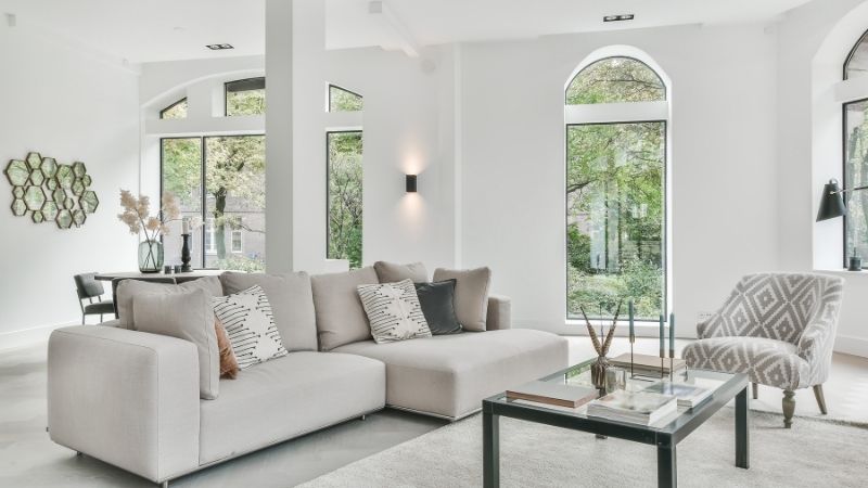
The living room is where you entertain, relax, and spend time with loved ones. It’s all about creating a warm and inviting atmosphere.
Best Colors for Living Rooms:
- Warm neutrals like beige or taupe create a cozy yet modern feel.
- Earthy greens and burnt oranges bring in a natural vibe, perfect for grounding the space.
- Deep blues exude elegance and can add a calming element.
Tips for Using These Colors:
- Paint one wall in a bold shade like forest green as an accent, leaving the others neutral.
- Use pops of color in your decor—think pillows, throws, or art pieces.
- Add texture with rugs or curtains in complementary hues.
👉 Looking to spruce up your living room? Check out this elegant throw pillow set for an instant style boost!
2. Bedroom: Your Restful Retreat
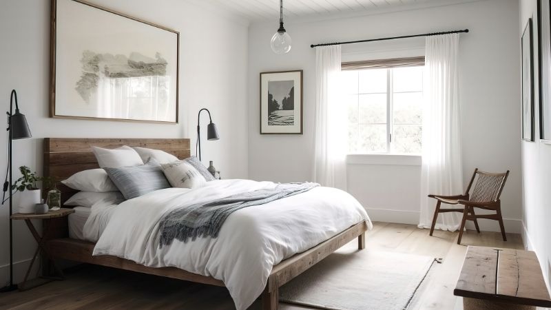
Your bedroom is your personal sanctuary, a place to unwind and recharge. The right colors can make all the difference in creating a tranquil space.
Best Colors for Bedrooms:
- Soft blues and greens are calming and ideal for relaxation.
- Lavender has a soothing effect while adding a hint of luxury.
- Pale pinks evoke warmth and romance without feeling overwhelming.
Tips for Using These Colors:
- Stick to light, muted shades for the walls to avoid overstimulation.
- Incorporate darker tones in your bedding or curtains for contrast.
- Use warm white lighting to enhance the softness of the colors.
👉 Elevate your bedroom decor with this luxurious duvet cover in calming lavender tones!
3. Kitchen: The Heartbeat of Activity
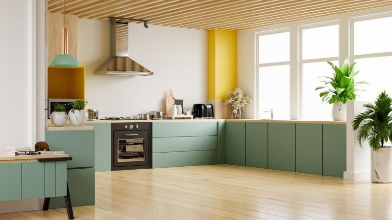
The kitchen is often a bustling hub, so it’s essential to strike a balance between energy and comfort.
Best Colors for Kitchens:
- Bright yellows inspire cheer and positivity—great for morning coffee vibes!
- Crisp whites and light grays offer a clean, modern aesthetic.
- Sage green or terracotta tones can bring warmth and an organic feel.
Tips for Using These Colors:
- Keep walls neutral and use bold colors on cabinets or backsplashes.
- Add colorful accents through utensils, vases, or a statement light fixture.
- Mix and match materials like wood, stone, or metal to complement your palette.
4. Bathroom: The Zen Zone
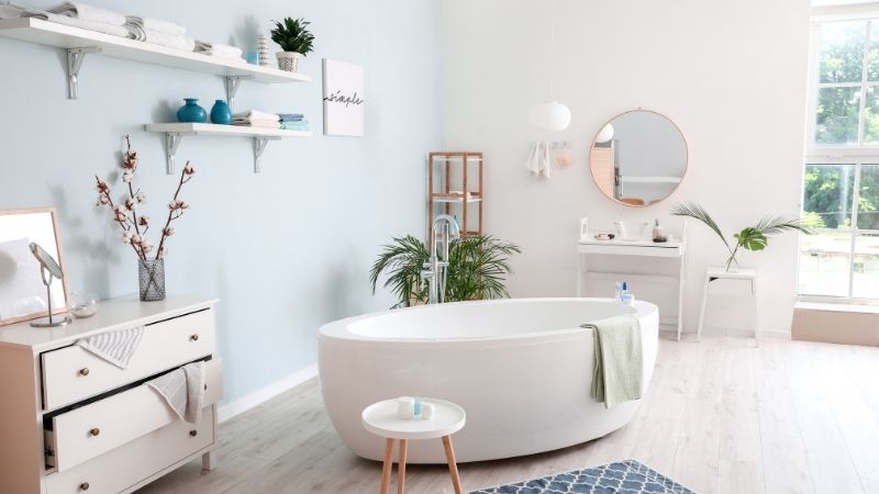
Your bathroom should be a spa-like escape, where you can relax and rejuvenate.
Best Colors for Bathrooms:
- Cool blues and aquatic greens evoke a serene, ocean-like vibe.
- Soft grays paired with white accents feel crisp and fresh.
- Warm peach tones can add a subtle glow, perfect for morning routines.
Tips for Using These Colors:
- Use tiles to introduce color without overwhelming the space.
- Choose metallic fixtures in complementary tones—think brushed gold with peach or chrome with blue.
- Add texture with fluffy towels or a patterned bath mat.
5. Home Office: Productivity Central
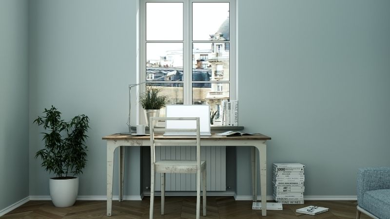
Your home office should inspire creativity, focus, and motivation. The right colors can help you achieve that perfect balance.
Best Colors for Home Offices:
- Greens (especially muted shades) enhance concentration and creativity.
- Blues encourage focus and productivity.
- Light yellows can add a touch of optimism and energy.
Tips for Using These Colors:
- Choose one dominant color and pair it with neutral furniture for a polished look.
- Use wall art or a patterned rug to bring in accent hues.
- Keep lighting in mind—natural light enhances cool tones, while warm light balances out brighter colors.
👉 Boost your workspace vibes with this sleek green desk lamp for a pop of color and functionality!
6. Dining Room: Where Conversations Spark

Dining rooms are all about sharing meals and making memories. Choose colors that foster connection and appetite.
Best Colors for Dining Rooms:
- Rich reds and burgundies stimulate conversation and appetite.
- Warm golds and mustards add elegance without being overbearing.
- Earthy browns create a grounded, inviting ambiance.
Tips for Using These Colors:
- Use wallpaper or a statement wall to introduce bold hues without overwhelming the room.
- Pair darker shades with metallic accents like gold candlesticks or brass frames.
- Keep tableware simple to let the room’s colors shine.
👉 Set the mood with this gorgeous gold centerpiece bowl—a showstopper for your dining table!
7. Kids’ Rooms: Playful and Inspiring
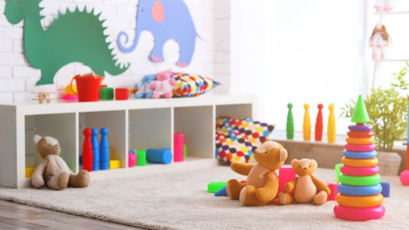
Kids’ rooms should be a blend of fun and functionality. Use colors that inspire creativity while keeping the space calm enough for restful sleep.
Best Colors for Kids’ Rooms:
- Bright yellows and oranges add energy and playfulness.
- Soft pastels like baby blue or mint green are soothing.
- Multicolor palettes with bold accents can make the room feel vibrant and cheerful.
Tips for Using These Colors:
- Opt for washable paints or wallpapers—because accidents happen!
- Use decals or stencils for easy, non-permanent designs.
- Let your child choose a favorite accent color for added personalization.
8. Entryway: First Impressions Matter
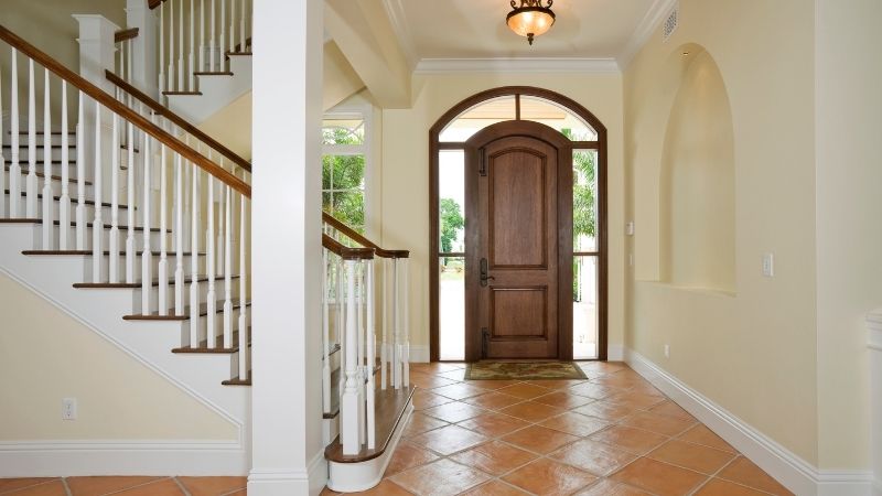
Your entryway sets the tone for the rest of your home. Choose colors that are welcoming and cohesive with the rest of your decor.
Best Colors for Entryways:
- Warm neutrals like beige or soft gray make a subtle yet elegant statement.
- Bold navy blue or emerald green can add a sense of drama.
- Muted oranges or sunset hues create warmth and charm.
Tips for Using These Colors:
- Add a mirror to reflect light and make the space feel larger.
- Use a runner or rug in a complementary shade to tie the look together.
- Introduce metallic or wooden accents for texture.
👉 Welcome guests in style with this sleek emerald green console table—both functional and fashionable!
Wrapping It Up
Color is a powerful tool in home design—it can set the mood, reflect your personality, and even influence how you feel in a space. Whether you’re looking to create a serene bedroom, an energetic kitchen, or a playful kids’ room, choosing the right hues will transform your home into a masterpiece.
For more design tips, follow Decormate on Pinterest, and don’t forget to check out our latest blogs for endless inspiration!