2025 is here, and it’s time to paint your life (and walls!) with the year’s most stunning color palettes! From earthy tones that ground you to soft pastels that soothe your soul and bold jewel shades that make your space pop, this year’s trending colors are all about creating a unique and vibrant environment. Let’s dive deep into the hues, tones, and combinations that are set to dominate the decor scene this year.
This post contains carefully selected links to products we love. If you choose to purchase through them, we may earn a small commission at no extra cost to you.
1. Earthy Tones: Bringing Nature Indoors
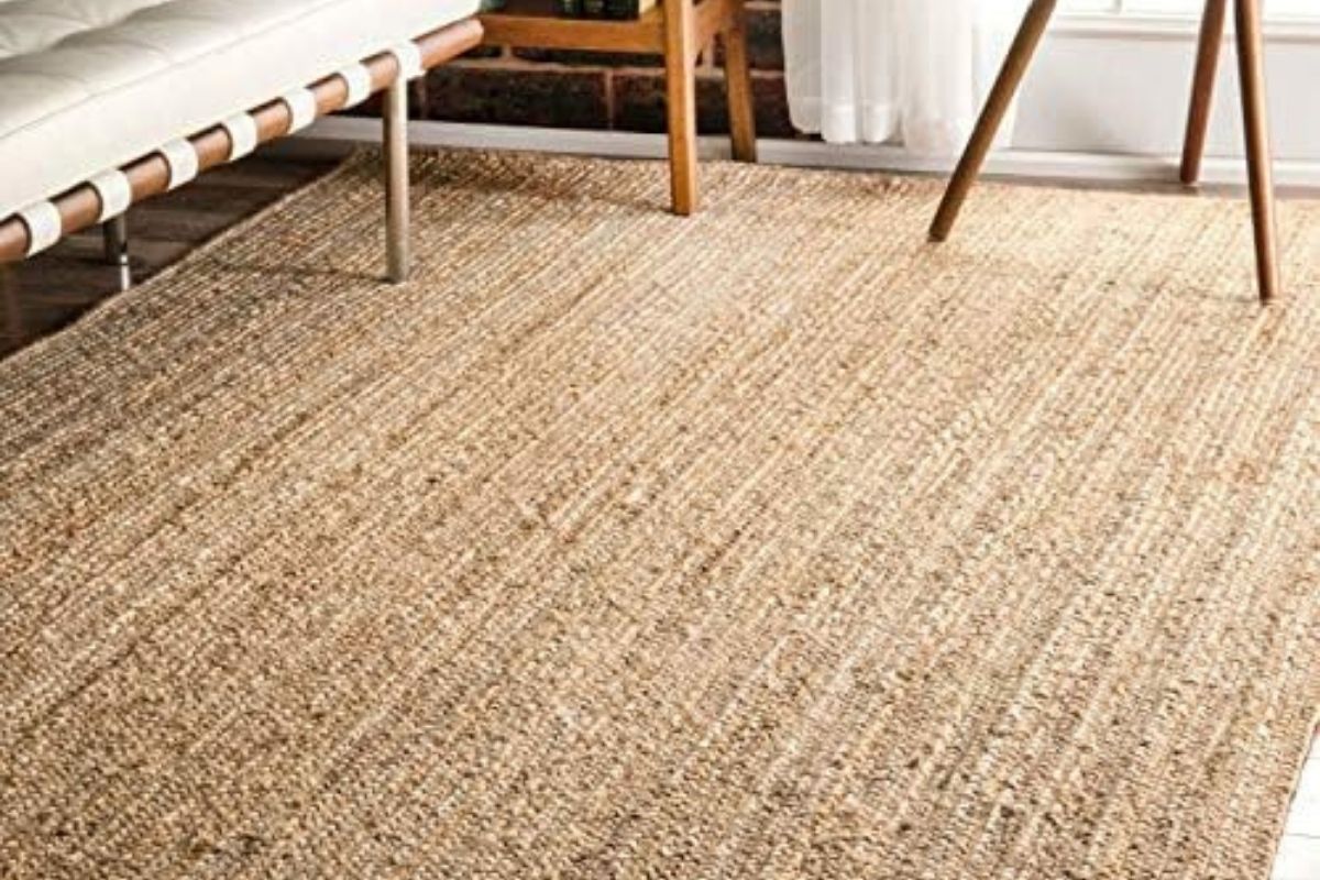
If 2024 was about sleek minimalism, 2025 is about reconnecting with nature. Earthy tones like terracotta, clay, sage green, and muted browns are making a massive comeback, creating spaces that feel warm, grounded, and oh-so-inviting.
Why Choose Earthy Tones?
Earthy colors reflect our growing desire to connect with nature. They create a calm and restorative atmosphere, perfect for unwinding after a long day. Plus, these tones are incredibly versatile and work well with both rustic and modern decor.
Tips for Using Earthy Tones
- Walls That Hug You: Paint your living room walls with a warm terracotta hue to make the space feel cozy. Pair it with white or cream furniture for balance.
👉 Check out this terracotta wall paint that oozes charm! - Go Green: Sage green cabinets in your kitchen or bathroom add a touch of organic luxury.
👉 We love this sage green paint for its calming vibe. - Textural Accents: Add clay pots, woven rugs, and wooden furniture to amplify the natural feel.
👉 This handwoven jute rug is a must-have for earthy vibes.
Perfect Pairings
Earthy tones pair beautifully with whites, creams, and blacks for a modern look. If you’re feeling adventurous, add a pop of mustard or rust for extra dimension.
2. Soft Pastels: The Dreamy Palette of 2025
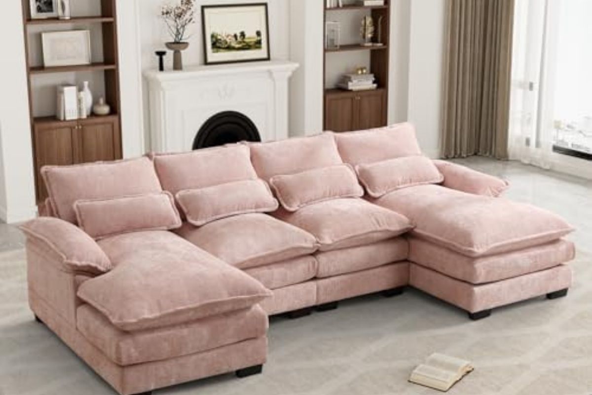
Move over dull neutrals; soft pastels are here to brighten your home without overwhelming it. Think blush pink, powder blue, lilac, and mint green—colors that whisper elegance while still feeling playful.
Why Choose Soft Pastels?
Pastels are perfect for creating light, airy spaces. They’re ideal for small rooms, as they make spaces feel bigger and brighter. Plus, pastels can blend seamlessly with various styles, from Scandinavian minimalism to eclectic boho.
Tips for Using Soft Pastels
- Pastel Walls for a Fresh Start: Try mint green or powder blue walls in your bedroom for a serene, tranquil vibe.
- Mix & Match Furniture: Combine a blush pink sofa with a light grey armchair for a chic, pastel paradise.
👉 This blush pink sofa screams elegance and coziness! - Accent with Accessories: Add pastel throw pillows, curtains, or even kitchen utensils for a subtle nod to the trend.
👉 These pastel throw pillows are the perfect addition to your couch!
Perfect Pairings
Soft pastels work best with light woods, white furniture, and metallic accents like gold or rose gold. Add a bit of texture with faux fur throws or velvet cushions for a luxurious feel.
3. Bold Jewel Shades: Make a Statement
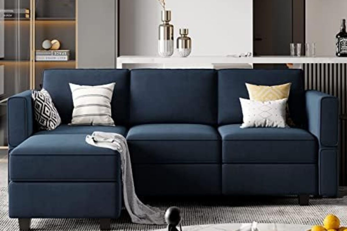
Ready to make a bold move? Jewel tones like emerald green, sapphire blue, ruby red, and amethyst purple are here to steal the show in 2025. These colors are all about drama, sophistication, and unapologetic glamour.
Why Choose Bold Jewel Shades?
Jewel tones are perfect for those who want their decor to make a statement. They’re rich, vibrant, and instantly elevate the look of any room.
Tips for Using Bold Jewel Shades
- Accent Walls: Go big with an emerald green or sapphire blue accent wall in your living room or dining area.
- Furniture with Personality: Opt for a velvet sofa in ruby red or amethyst purple to create a focal point.
👉 We’re obsessed with this sapphire blue velvet sofa—it’s a showstopper! - Small Pops of Color: If you’re not ready to commit to bold walls or furniture, start small with jewel-toned vases, lamps, or art pieces.
Perfect Pairings
Jewel tones look stunning when paired with metallics like gold, brass, or silver. For a more modern look, combine them with deep blacks or dark woods. Layer in textures like velvet, silk, or leather for added richness.
4. Neutrals with a Twist: Elevated Classics
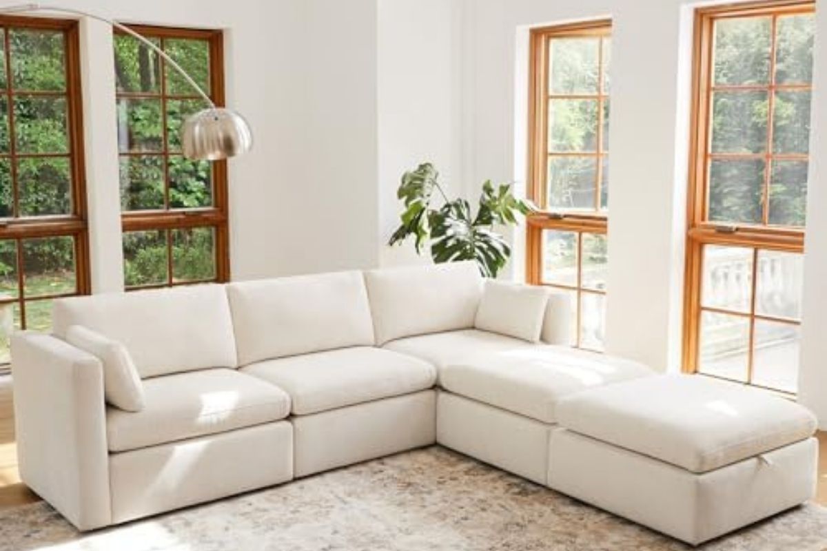
Neutral palettes are not going anywhere, but 2025 is all about giving them a modern twist. Think greige (a blend of grey and beige), taupe, and creamy whites with subtle undertones of pink, green, or yellow.
Why Choose Neutrals with a Twist?
These shades offer timeless elegance with just the right amount of personality. They’re perfect for those who love neutral decor but want something a bit more exciting.
Tips for Using Neutrals with a Twist
- Walls That Shine: Greige walls add depth and warmth without being overpowering.
- Layer Textures: Combine neutral-colored furniture with textured throws, rugs, and pillows for a cozy, layered look.
👉 We recommend this cream knit throw for its softness and style. - Highlight Undertones: Use decor pieces that complement the undertones in your neutral palette. For example, pair a taupe sofa with blush pink cushions.
👉 This taupe sofa is a classic with a modern edge.
Perfect Pairings
Pair neutrals with natural materials like linen, jute, or wood for a calming, earthy feel. Add metallic or glass accents to keep things fresh and modern.
5. Monochromatic Magic: One Color, Multiple Shades
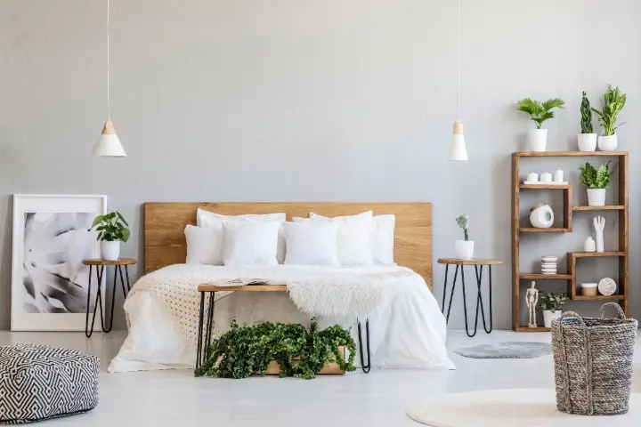
Monochromatic palettes are having a major moment in 2025. By layering different shades of the same color, you can create a cohesive, sophisticated look that feels anything but boring.
Why Choose Monochromatic Palettes?
They’re easy to pull off, visually striking, and incredibly versatile. Whether you’re into bold reds or calming blues, there’s a monochromatic palette for everyone.
Tips for Using Monochromatic Palettes
- Shades That Blend: Choose three shades of the same color—light, medium, and dark—and use them across your walls, furniture, and decor.
- Patterns and Textures: Incorporate different textures like velvet, linen, or wool to add depth to your monochromatic space.
👉 We love these textured throw pillows for monochromatic layering! - Go Big with Accessories: Add vases, lamps, and rugs in varying shades of your chosen color for a polished finish.
👉 This monochromatic rug is a subtle yet stunning statement piece.
Perfect Pairings
Monochromatic spaces benefit from contrasting materials like wood, metal, or stone. Use mirrors or glass to reflect light and keep the space from feeling too heavy.
6. Unexpected Pairings: Break the Rules
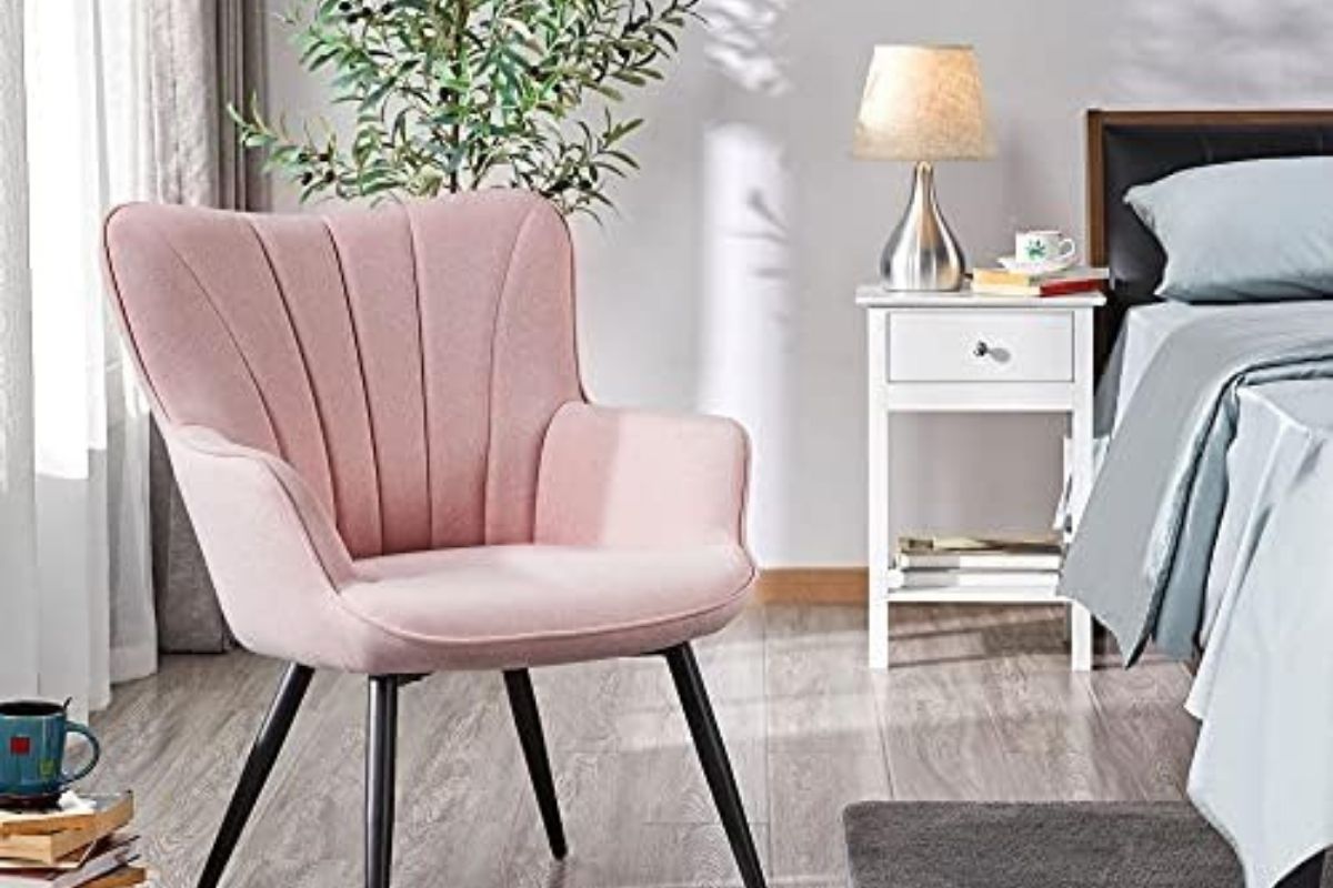
Why stick to one palette when you can mix and match? 2025 encourages you to experiment with unexpected color combinations that break the traditional rules.
Why Choose Unexpected Pairings?
They add a sense of whimsy and creativity to your decor, making your space truly unique.
Tips for Using Unexpected Pairings
- Combine Warm and Cool Tones: Pair terracotta with powder blue or emerald green with blush pink for a fresh, modern look.
👉 This blush pink chair is the perfect contrast to bold jewel tones! - Play with Patterns: Use patterned wallpaper or rugs that incorporate multiple colors for a cohesive but eclectic vibe.
- Accent with Bold Decor: Add a few standout pieces in unexpected colors, like a mustard yellow lamp in a pastel room.
👉 This mustard yellow table lamp is quirky and chic.
Perfect Pairings
The key to unexpected pairings is balance. Use neutral tones as a base and let your bold colors shine through as accents.
Wrapping It Up
2025 is all about creating spaces that reflect your personality, style, and connection to the world around you. Whether you’re drawn to the earthy tones of nature, the soothing embrace of soft pastels, or the dramatic flair of bold jewel shades, there’s a palette for every mood and moment.
Remember, experimenting with color is one of the easiest ways to transform your home. Start small with accent pieces or go big with bold walls—whatever feels right for you. And don’t forget to check out the amazing products we’ve linked throughout this blog to bring these color trends to life in your own space!
For more tips, inspiration, and ideas, follow Decormate on Pinterest and check out our other blogs. Happy decorating! 🌈